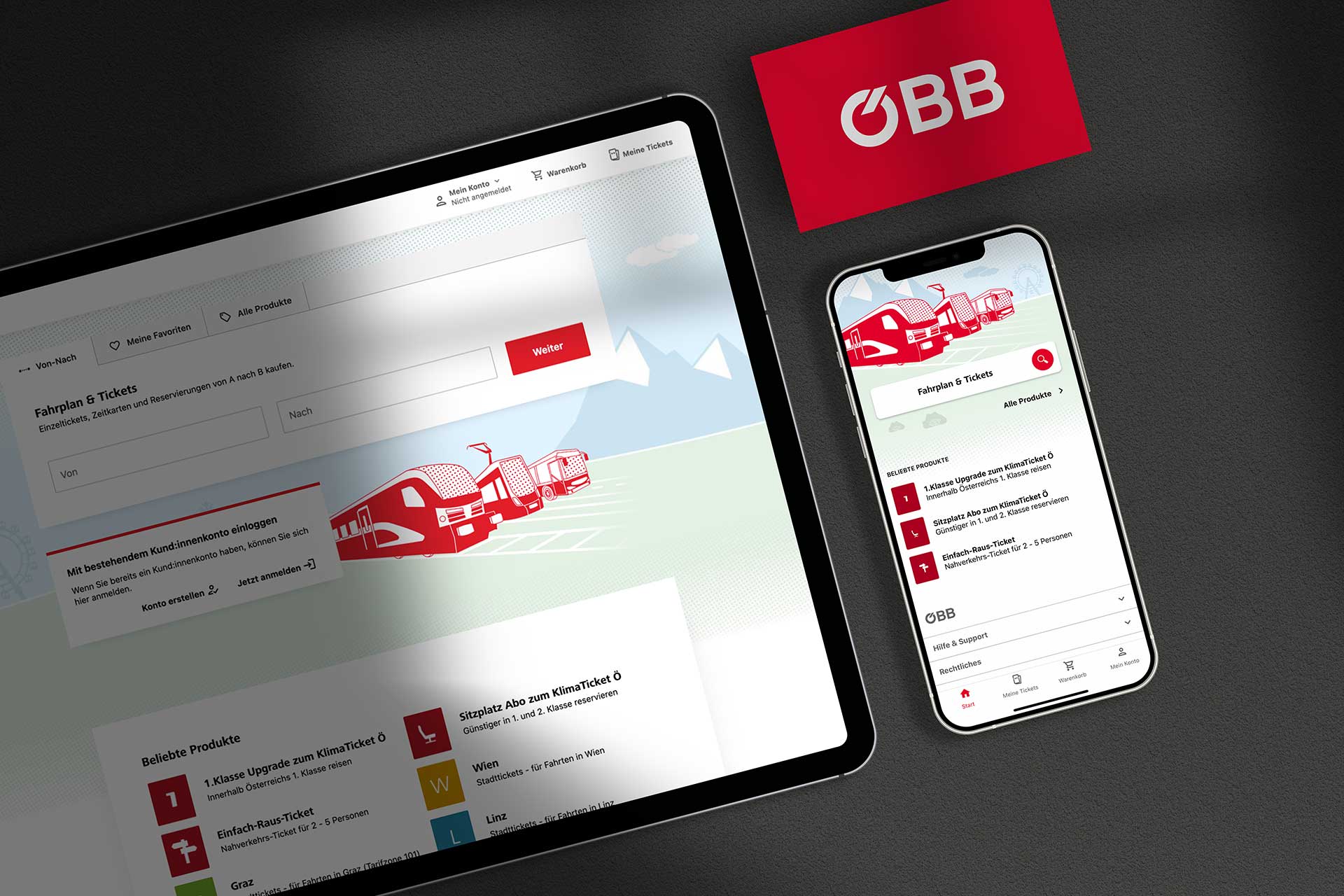
New user interface design for the ÖBB App open and arrive – including ticket, navigation, subsequent payment and seamless travel to your destination. The new ÖBB ticket store offers state-of-the-art functions and has a fresh new look. With illustrations, UI design and videos by dmcgroup.
Client: ÖBB – Austrian Federal Railways
Date: 2022/2023
Services:
Our services
Next stop: My sofa
In the new ticket store, ticket purchases don’t end at the station, but on the sofa: travelers can reach their destination by train, bus, streetcar, bike and on foot. Our videos and screens in the app explain the new functions.
- Development of the new illustration style
- Advantage communication: Production of explanatory videos
- User Interface Design & Consulting
Advantage communication & explanatory videos
SimplyGo! – Just drive off and pay tomorrow.
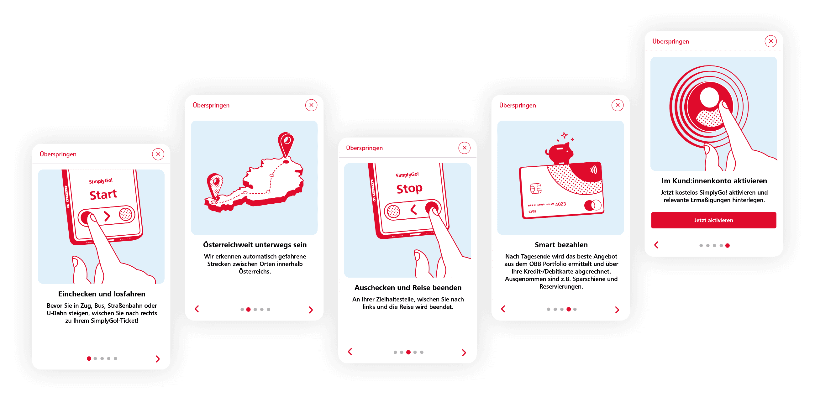
SimplyGo! is a small revolution: start the app and travel on all public transport at will. The distance traveled is automatically billed the next day at the lowest rate. Our illustrations and explanatory videos explain the benefits and help the function to succeed.
The ÖBB Webshop project in brief
Initial situation
Low intermodality (cross-provider travel chains are not fully mapped) and new SimplyGo! feature not yet integrated
Store seems rather technical and the brand does not come to fruition
Functions and purchasing processes were not fully explained
Some clients were not sufficiently considered in the current style
Goals and task
Integration of two new store features: SimplyGo and intermodality
Improving the brand experience
Independent look with high recognition value
More communication:
- Optimized user guidance
- Better explanation of features, benefits, processes
Efficient maintenance: updates and changes should be easy to implement
The design concept
Uniform look for all services and all partners in the store
Illustrations make it possible to
- present complex issues very simply
- to reduce to the essentials
- Explanatory texts are better understood
- Changes/updates are easy to implement
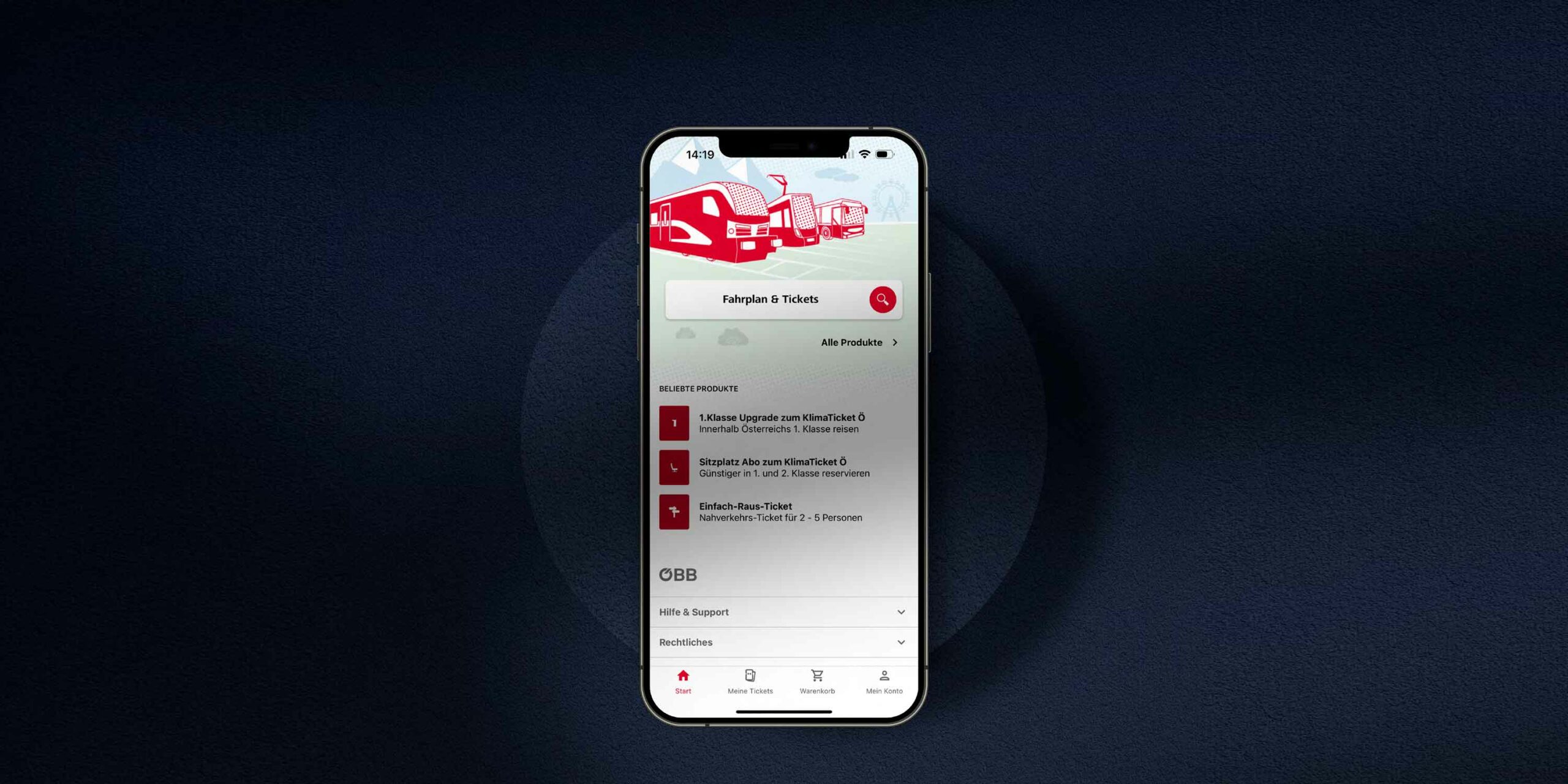
- The start page explains the app and is the starting point for all other functions.
- Splash screen is a placeholder when loading or starting the app and explains that tickets can be purchased for all public transport in Austria
- The onboarding screen explains the functions and benefits of the app when you open it for the first time. We have developed static onboarding screens to explain the new SimplyGo function
- The onboarding screen for other clients such as IVB (Innsbrucker Verkehrsbetriebe) or VVT (Verkehrsverbund Tirol) must match their appearance and this requirement can be met with line graphics
- Loading graphics and background images for the store
The new illustration style
The core theme is in the foreground (image in brand color), backgrounds are calm and bright (e.g. landscape)
Line graphics and background can be easily recolored for different clients
Implementation of animated splash screens and animated onboarding screens for the app
Our Team
Our experts had one goal: to contribute to optimizing the user experience of the ticket store. The result is unmistakably ÖBB, without irritating details, it’s all about the best way to get a ticket.
More Cases
Continue browsing through our projects
Would you like to find out more about our services or do you have any questions? I will be happy to help you. Contact me to discuss your concerns and receive customized solutions.
Let´s
talk

Maren Fick
M +43 1 585 66 10115
maren.fick@dmcgroup.eu


