
Every digital product or service benefits considerably from accessible design.
Digital products, from websites and apps to digital service kiosks, should be accessible to everyone. After all, the strength of digital lies in its ability to serve individual needs through customisability. Accessible web design aims to make digital products usable for everyone, regardless of their individual abilities and limitations. This includes not only taking into account permanent physical or cognitive impairments, but also a variety of circumstances and needs that users may have at certain points in their lives. As a UX agency, our goal is to make digital experiences accessible for all users. With this in mind, we share our best tips for accessible web design so that your website is not only aesthetically pleasing, but also easily accessible for people with different abilities.
What does accessible design mean?
Essentially, an accessible product enables people to perceive, navigate and interact with it seamlessly, as effortlessly as possible. Accessible design aims to create products that cater for diverse needs and preferences, making digital experiences inclusive and accessible to all.
Why is accessible web design useful?
Accessible design is not just nice to have; it is a legal obligation in most national and supranational jurisdictions. Laws such as the European Accessibility Act stipulate that digital products must be accessible to all users. In addition to legal obligations, there are compelling reasons why accessibility should be prioritised in digital design:
- Greater reach: Accessible websites and apps are not only easier for people with disabilities to use, but also easier for search engines to index. This means you are easier for everyone to find and can potentially expand your audience.
- Ageing population: As the population ages, the need for accessible design becomes even more important. Taking into account people with declining vision, hearing or mobility ensures that your products remain relevant and usable.
- Competitive advantage: Investing in accessible design gives your organisation a competitive advantage. By catering to a diverse audience, you position yourself as inclusive and responsive to users’ needs, which can improve brand reputation and customer loyalty.
- Legal compliance: Many international laws prescribe accessibility standards for digital products. Compliance not only minimises legal risks, but also demonstrates a commitment to social responsibility and inclusivity.
- Inclusion: Ultimately, accessible design is about giving all users a sense of belonging. Everyone deserves to feel welcome and included in the digital space, regardless of their abilities or limitations.
Contrary to common misconceptions, the implementation of accessibility features does not necessarily compromise visual aesthetics. The majority of accessibility improvements can be made ‘below’ the surface of the visual user interface by optimising the semantic structure of the source code and adding important attributes and parameters.
Understanding of user types and supporting technologies
When designing for accessibility, it is crucial to consider different types of users and the assistive technologies they use:
- Screen reader users: People with visual impairments rely on screen readers to navigate digital content. Design considerations include providing text alternatives for all content, ensuring keyboard operability and providing instant feedback on user actions.
- Braille display users: Deafblind people often rely on the use of braille displays to enable tactile interaction with a digital product. The simplification of design elements and the provision of text-based alternatives for multimedia content are essential conditions for the support of braille displays.
- Screen zoom users: People with visual impairments use screen magnifiers to enlarge content. Designing with sufficient contrast, clear hover/focus states and fully scalable interfaces meets their needs.
- Users of subtitles and transcripts: People who are deaf or hard of hearing are dependent on subtitles and transcripts for multimedia content. The inclusion of subtitles for videos and transcripts for audio ensures accessibility for this user group.
- Keyboard users: For people with motor impairments, there is no alternative to operating a digital interface via the keyboard. Therefore, full keyboard operability improves accessibility for this user group.
- Voice control users: Users with motor impairments can alternatively use voice control to use a digital product. Although voice control can improve accessibility, it is important not to rely solely on this function and to consider possible limitations such as stuttering.

In order to achieve accessible design, a variety of measures must be considered and implemented. The specific measures vary from case to case, as they depend heavily on factors such as the relevant target groups and their specific needs and abilities, as well as the product and the touchpoints/platforms. We have summarised some of the most important points for you below.
Need
help?
We are experts in accessible web design. Our dedicated team of designers, developers and content managers work hand in hand to take your digital presence to the next level and make it accessible. Ready for the next step? Contact us and find out more about our services.
Size and legibility
One of the key points in terms of usable and readable information concerns the size of texts and interactive elements.
Adequate text size for readability
The ideal text size for optimum readability depends on various factors, such as the average visual acuity of the relevant target groups: Are they mainly young or rather older people – or are there a disproportionate number of people with visual impairments in the relevant target groups? The DIN-1450 standard contains recommendations for text size based on ‘normal’ visual acuity, specified with a minimum of 70% – the visual acuity that prevails in the majority of the population. Together with other factors such as typical lighting conditions, viewing distance and the characteristics of the selected font (ratio of x-height of the font to the font size), the minimum text sizes for optimum readability can be calculated. In this context, the font size calculator of the German Association for the Blind and Visually Impaired is highly recommended.
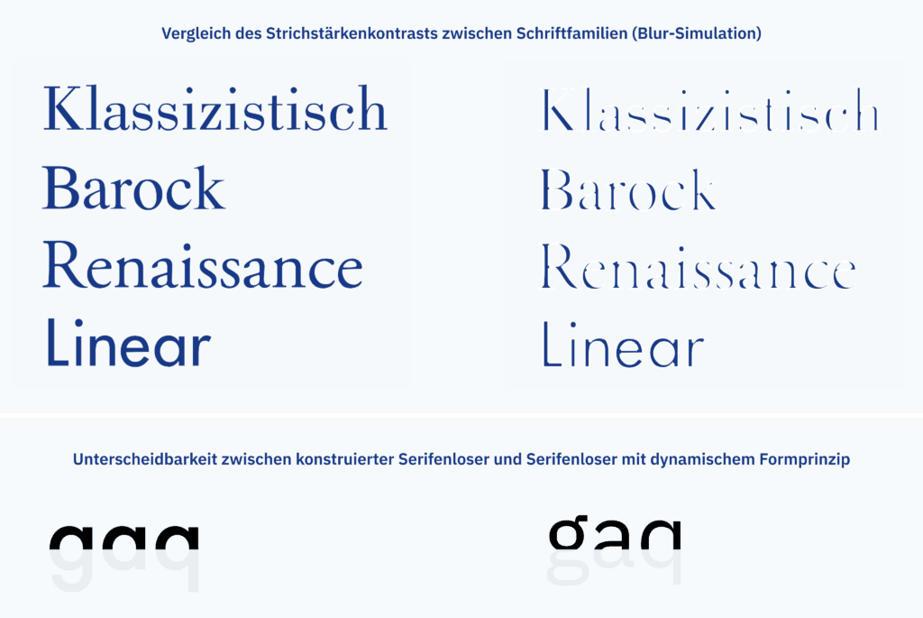
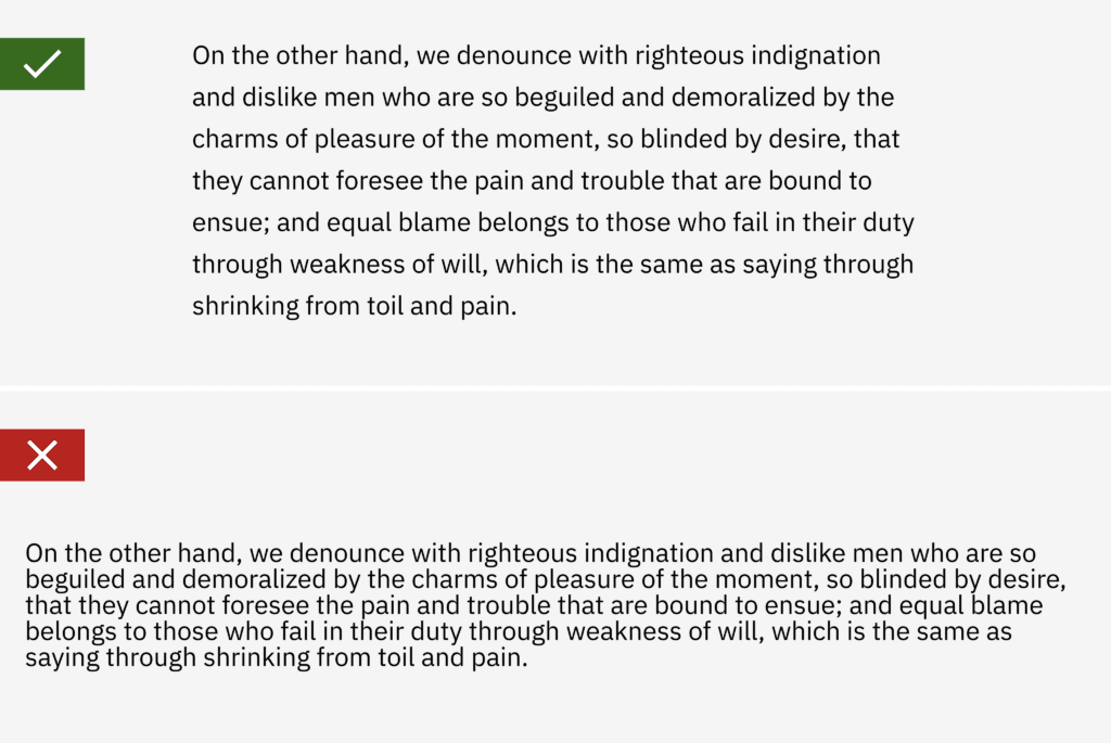
For most web-based projects, no calculation work is necessary as basic rules of thumb are known. For very specialised project setups with unusual devices or target groups, however, the effort is recommended in any case. For the redesign of the user interface of ATMs for a bank, for example, we specifically derived the minimum sizes for text and interactive elements using applicable standards. For standard web design, a minimum font size of 16px is often recommended for continuous text. Larger is better in most cases in order to guarantee optimum readability without adjusting the browser settings. Equally important for good readability are factors such as line height (which should be at least 1.5 times the font size) and choosing the right font for the amount of text and the medium. In general, dynamic sans serif fonts with open characters are more legible than serif fonts or geometric sans serifs.
Text scalability
Even more important than selecting the right minimum font size is giving users the option of scaling the text according to their own preferences by using the settings of the operating system or browser. This is ensured if text content in the source code is also available as text. You should test your layout to support text scaling of up to 200% without the risk of reading difficulties or unusability of the page. This is the success criterion defined by the WCAG.
Buttons and links: The size of interactive elements
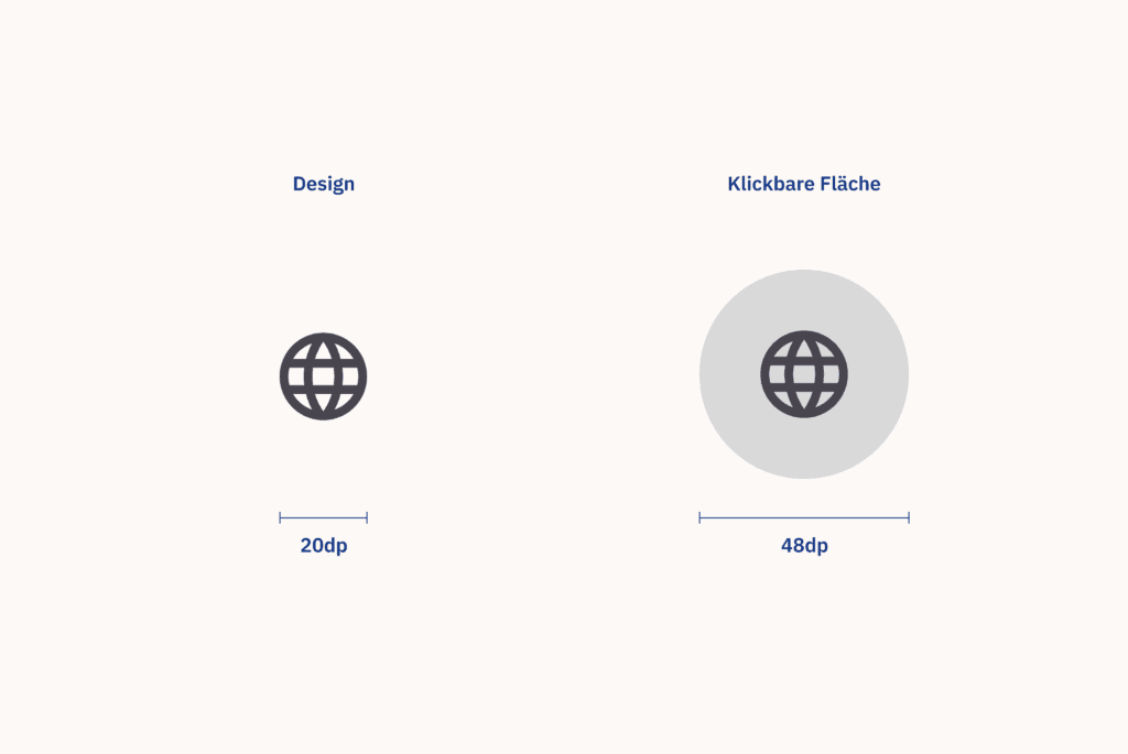
In addition to the size of text, the size of user interface elements that trigger actions is crucial. Buttons, menu items, form fields and other interactive elements must be large enough to be easily tapped or clicked, especially on touch devices. The Web Accessibility Initiative of the W3C recommends a minimum size of 44×44 CSS pixels, as do the Apple User Interface Guidelines. Google relies on a recommendation of 48×48 resolution-independent pixels for touch targets.
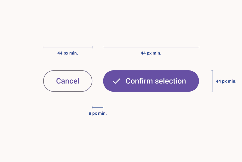
However, these minimum sizes do not have to directly influence the visual design: the underlying click/touch target can of course be larger than the visual representation of the element in order to achieve a more light-footed display. To avoid accidental clicks or touching of neighbouring buttons or links, a minimum distance of 8 resolution-independent pixels should be maintained between the clickable elements.
Visual hierarchy
A clear visual hierarchy, manifested through text size differences and spacing rules, helps users to better navigate and understand the content. Headings should be used to clearly structure content, with larger text sizes conveying greater meaning. As a rule of thumb, each web page should only use one H1 heading at a time. It is the most important heading on the page and must communicate the overall theme or goal of the page. It should therefore also use the largest font size. In addition to the H1, other headings should be used to group the information properly and make the text easier to read. A clear hierarchy from H1 to H6 should be used to enrich the text with semantic information. Headings should be used consecutively within each section of content.
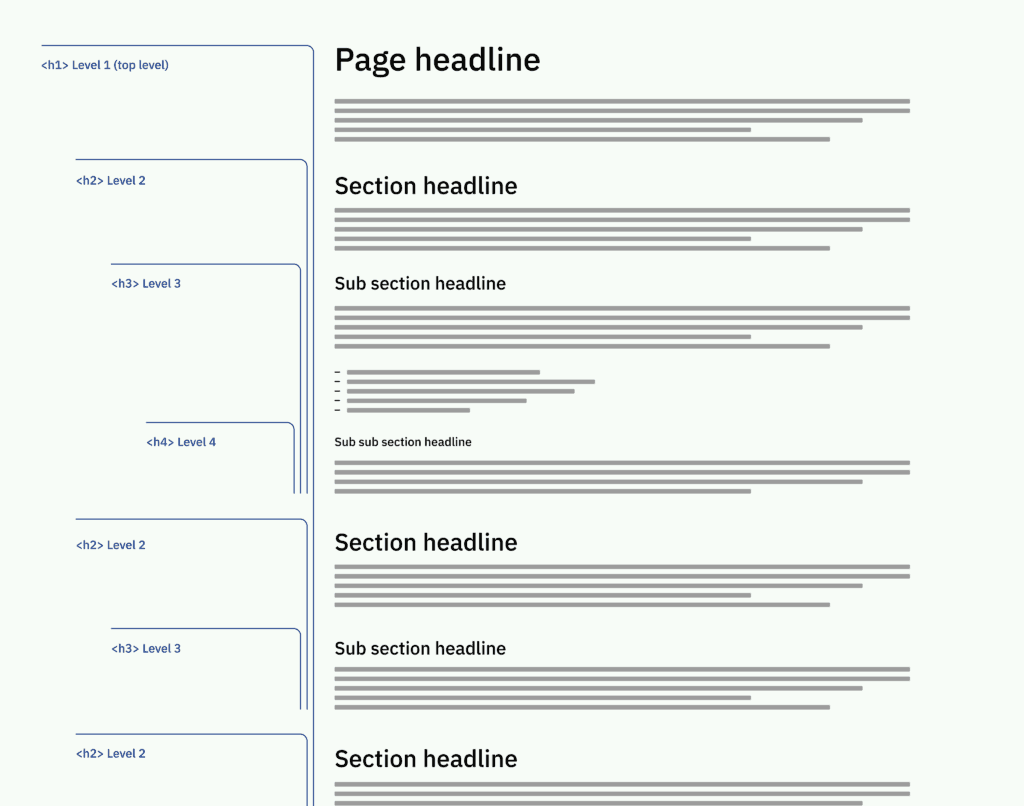
Accessible design requires well-structured content and the proper use of semantic markers for headings and lists.
Colour and contrast
Colour and contrast ratios have a major influence on whether content can be perceived by as many users as possible.
Sufficient contrast for meaningful information
Text and interactive elements must have sufficient contrast to the background to ensure legibility and recognisability. The WCAG defines specific contrast ratios to guarantee sufficient legibility and recognisability at different levels.
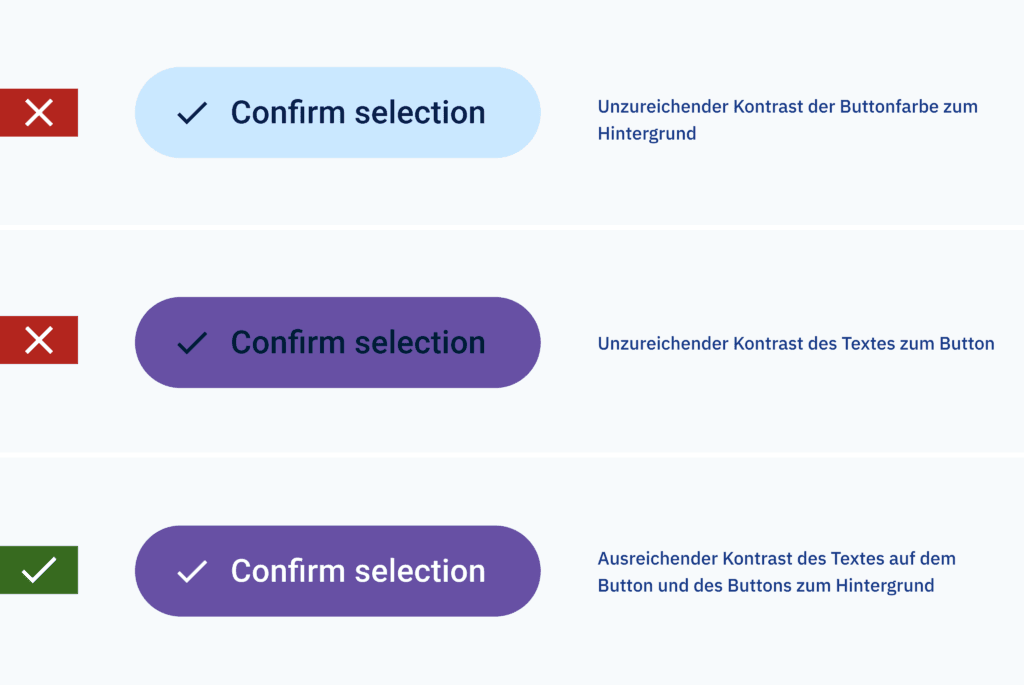
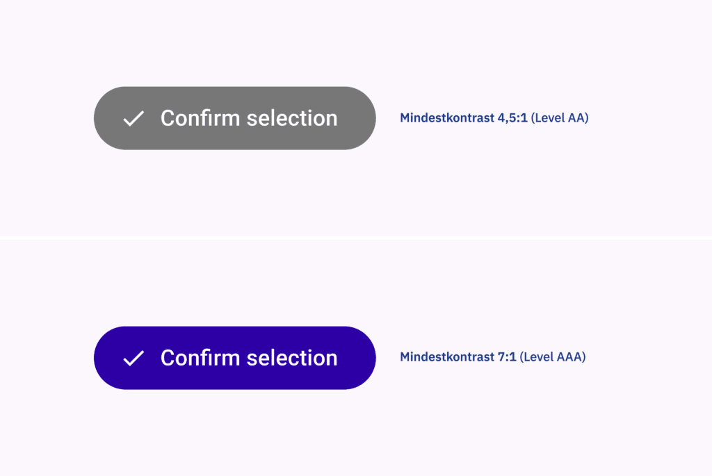
To fulfil the requirements of Level AA, the minimum contrast ratio between text and background for normal text is 4.5:1, while 3:1 is required for large text (at least 18pt or 14pt bold) and UI components. Meeting the requirements of Level AAA requires a higher standard, with normal text requiring a contrast ratio of 7:1 and large text a ratio of 4.5:1. Maintaining these ratios not only ensures compliance with accessibility standards, but also improves the usability and inclusivity of digital content for all users.
Multi-sensory information
Do not rely solely on colour to convey important information. People who cannot distinguish certain colours would miss the information conveyed by colour. Visual elements such as icons that are essential to understanding must be accompanied by descriptive text. This ensures that this information is accessible to all users, including those with colour blindness or visual impairments. Accessible design requires that relevant information or user interface elements utilise more than just one sensory channel. Underlined links, for example, can also be recognised by colour-blind people in continuous text. In contrast, links that only use a different text colour as a distinguishing feature could be overlooked.
Structural considerations
A well-structured layout and clear navigation improve the user-friendliness and accessibility of digital products.
Page title
Each page should have a clearly descriptive title that accurately reflects its content or purpose. This helps users to understand the context of the page, especially when using assistive technologies such as screen readers. In addition, a concise and meaningful page title that summarises the topic of the page has a big impact on the page’s ranking by search engines.
Keyboard accessibility
The ability to interact with a digital product using more than just mouse or touch input is crucial for accessibility. Make sure that all interactive elements such as buttons, menu items and links are also accessible via keyboard navigation. This ensures compatibility with various assistive technologies and supports users with motor impairments who cannot use mouse or touch gesture input.
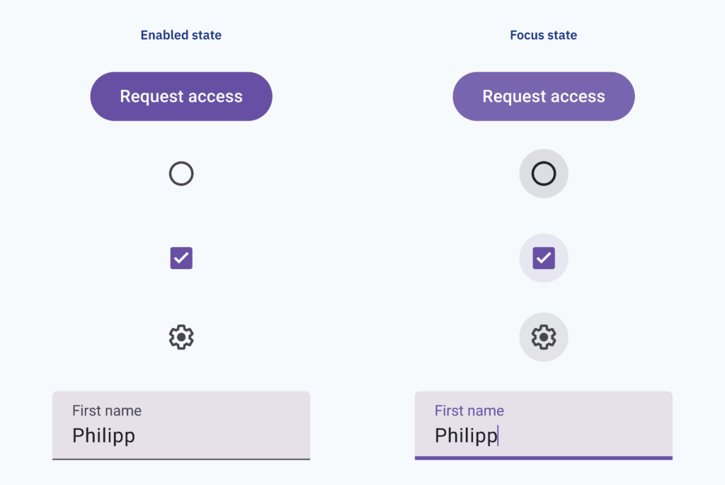
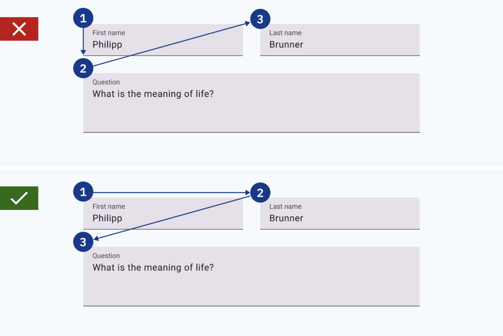
In addition, the correct tab order ensures logical navigation for keyboard users. Focus states are essential for all interactive controls to support navigating a page via keyboard input. Browsers apply their own style of focus states by default, but implementing your own customised focus states is recommended. The tab order must reflect the logical flow of information and not the order of the elements in the markup.
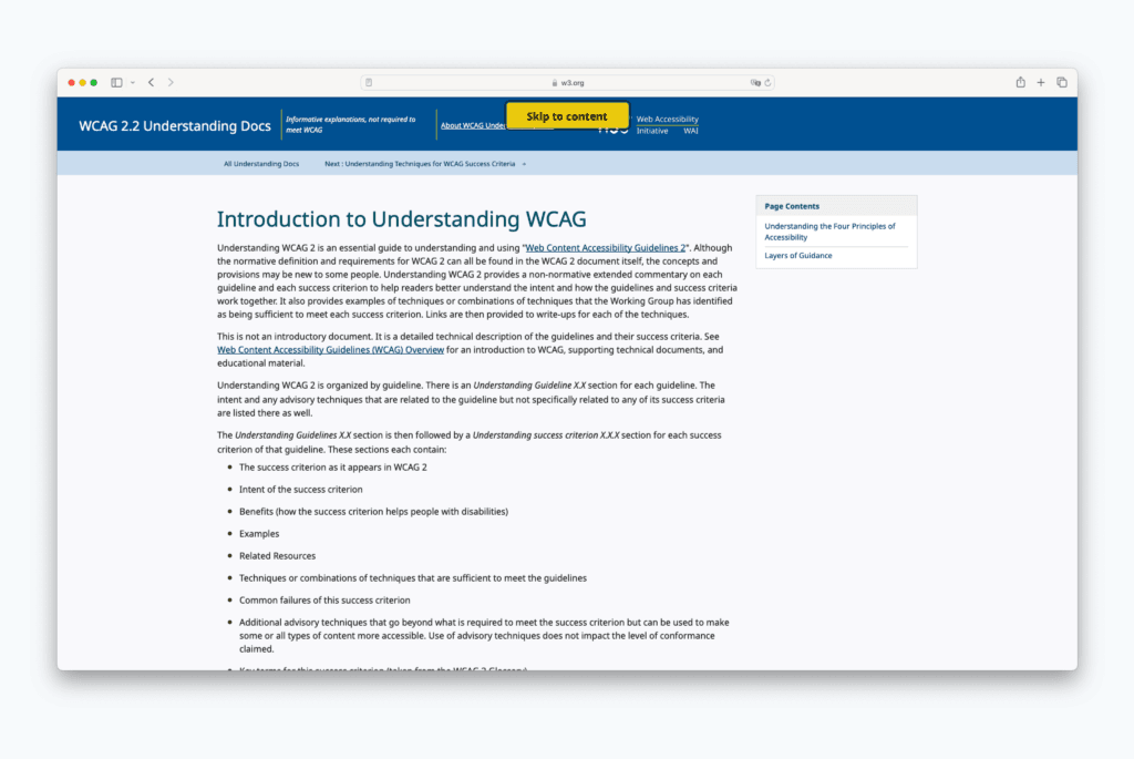
Skipping links
Skip links at the top of the page allow users to skip redundant content such as navigation and headers and go straight to the main content. This feature is particularly useful for screen reader users who would otherwise have to navigate through multiple menus and links on each page. The proper use of HTML/ARIA landmarks (header, nav, main, footer) semantically improves the structure of the website. It points screen readers directly to the right place in the content.
Avoiding deactivated elements and focus traps
Deaktivierte Formularfelder oder Schaltflächen können Usability-Probleme verursachen, sind aber auch besonders unzugänglich. Standardmäßig sind sie nicht fokussierbar für Personen, die die Tastatur oder andere assistive Technologien verwenden, um durch ein Formular zu navigieren. Daher können solche Benutzer:innen leicht übersehen, dass das Element überhaupt existiert. So kann beispielsweise in einem Web-Formular die deaktivierte Schaltfläche der einzige Hinweis für Nutzer:innen sein, dass einige Eingaben noch fehlen oder ungültig sind. Benutzer:innen assistiver Technologien werden gar keinen Hinweis darauf erhalten, dass fehlerhafte Eingaben vorliegen – und daran scheitern, fortzufahren. Am Besten ist es, deaktivierte Elemente ganz zu vermeiden. Popup- oder Modalfenster, die über der eigentlichen Benutzeroberfläche liegen, bringen oft die Tab-Reihenfolge durcheinander oder sind über die Tastatur gar nicht errecihbar. Das gilt übrigens auch für viele Drittanbieter-Add-Ons wie Cookie-Benachrichtigungsbanner. Daher sollte die Implementierung solcher Patterns mit besonderer Sorgfalt erfolgen, sofern sie nicht gänzlich vermieden werden können.
Forms with sections and proper labelling
Accessible forms require keyboard operability as an alternative to mouse or touch input. Therefore, each form field needs clear focus states to provide good orientation for keyboard users. Form fields should also be supported by clear and descriptive labels to communicate their purpose or the expected input. Proper and always visible labelling helps all users to understand the form and fill it out correctly. It is important to provide all necessary contextual information for the respective field. This way, assistive technology users get all the information they need to complete the form when they need it.
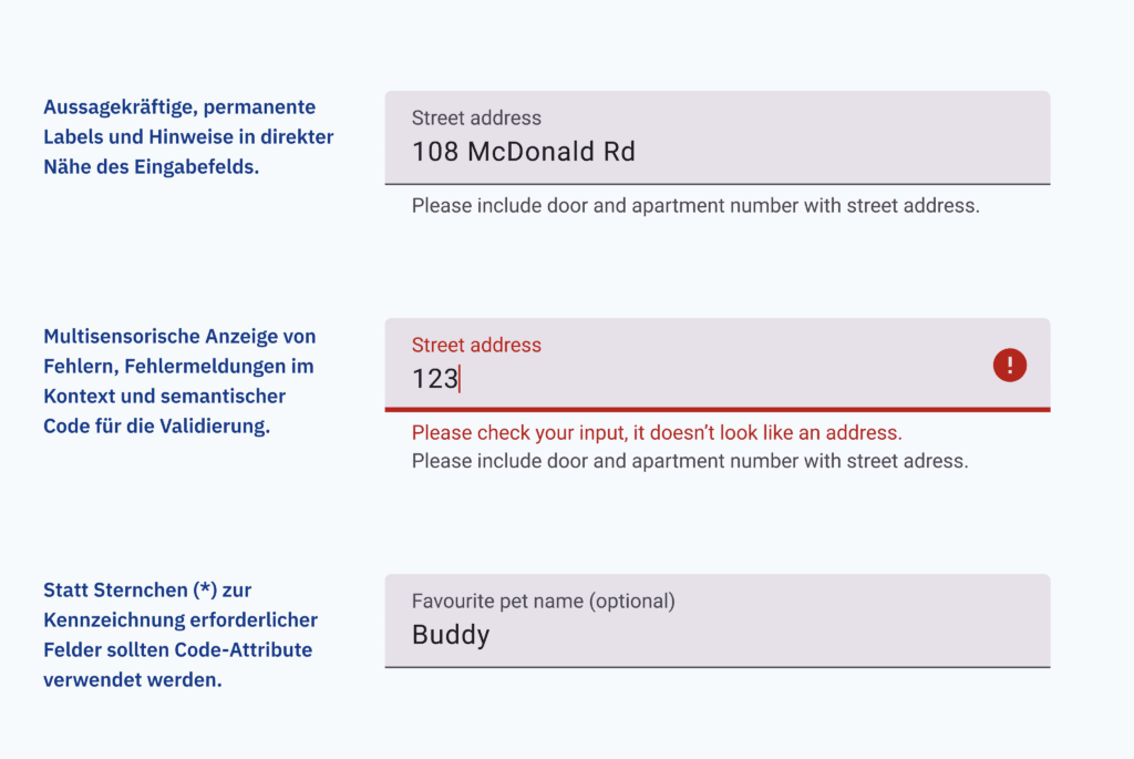
Forms should be clearly structured with <fieldset> and <legend> tags in the frontend code. All control elements should be placed in the immediate vicinity of the form elements they are intended to control. For example, ‘Edit’ or ‘Delete’ buttons only make sense directly next to the elements they influence. Required form fields are often marked with an asterisk in conventional form design. A practice that doesn’t make much sense for screen reader users. An ideal approach would be a form that only consists of required mandatory fields and has no optional fields at all. In addition, required fields should be appropriately labelled in the frontend code by using the aria-required attribute. A similar attribute could be used to hide field hints like an asterisk from screen readers. Accessible validation of forms is another complex topic. It requires many code-side measures such as the use of ARIA attributes. For all users, forms require clear error messages and sufficient information to be able to correct errors.
Tables
When using data tables, it is important to map columns and rows semantically correctly in the source code. Table captions can provide additional explanations of the data material. For complex tables, you should consider simplifying the presentation or providing additional explanations to improve comprehension. Summarising the message of the data material improves usability for people using a screen reader.
Zoom and orientation
User interfaces should allow content to be enlarged or zoomed without compromising functionality or layout. Also ensure that websites are usable in both portrait and landscape formats to accommodate user preferences and device capabilities.
Need
help?
As a digital UX agency, we support you in optimising your online presence and making it accessible. Together, we create user experiences that are accessible and compelling for everyone.
Text to convey meaning
Textual content should be structured and concise to appeal to users with different reading or concentration abilities. Use clear and understandable language to avoid confusion and ensure that the intent of the content is clearly communicated.
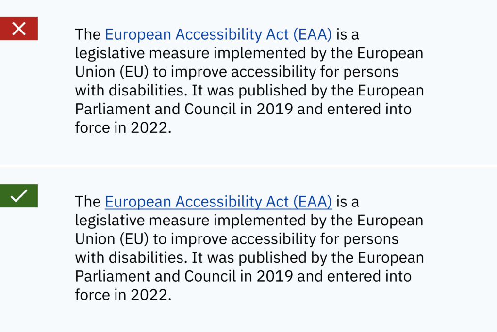
Alternative texts for images
Providing descriptive alt text for images is essential for screen reader users. The alt text should convey the purpose or content of the image. A basic distinction must be made here between essential content and decorative elements. Images should contain a descriptive alternative text that conveys their purpose or content for users. Alt texts should be concise yet informative and provide important contextual information about the image that would otherwise only be available by viewing the image. In addition, the alt text of an image has an impact on SEO and can help to increase the visibility of your website and content. A simple rule of thumb: if removing an image would reduce the information value of the page for users, the image is informative and needs alternative text. The right alternative text depends on the context in which the image is used. Complex images such as diagrams or very detailed and relevant illustrations require specific descriptions. In this case, the alternative text should only provide an overview and refer to a more detailed description below the diagram/image. Images that do not add any informational value or are only included for decorative purposes do not require alternative texts. In this case, the alt tag should remain empty.

Accessible links
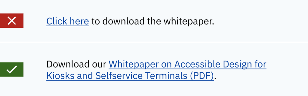
Links should have meaningful and descriptive anchor texts that convey their purpose or goal. Do not use vague or ambiguous link text such as ‘click here’ or ‘more’. These generic terms can be confusing to users, especially when taken out of context. Short generic link texts for article previews can still be used as long as they contain a meaningful, more detailed link text in the code. Accessible link texts should make sense without additional information. Just ask yourself: Is the purpose or goal of the link revealed?
Time-based content and animations
Animated content can add variety and uniqueness to a digital service or product. However, certain precautions should be taken to ensure accessible design.
Accessibility of animations
Avoid the use of high-frequency animations or animated images with more than 3 ‘flashes’ per second. These high-frequency animations can cause distractions or discomfort, including epileptic seizures for some users. Always offer options to pause or control animations to suit individual preferences and needs. This is especially important for video content longer than 5 seconds. In addition, audio and video material should never be played automatically. This is annoying for everyone, but especially for people who have no way of stopping the playback immediately.
Subtitles and transcripts
Videos should include synchronised subtitles to make the content accessible to users who are deaf or hard of hearing. In addition, audio descriptions may be required to convey important visual information to users who cannot see the video. Subtitles in multiple languages are also extremely useful for people who do not speak the language of the medium. This is also an accessibility issue if parts of your audience speak other languages. Audio content requires a transcript to be accessible to people with hearing impairments.
Sufficient time
Users with restrictions may need more time to complete tasks than others. Therefore, these users must be given enough time to respond to things like session timeouts, re-authentication or other timed events. Therefore, provide a calm environment for reading and interaction by offering customisation options for time limits. Or better yet, remove the need for timed interactions altogether.
Accessible design should not be an afterthought
Accessible design is a complex topic. Each of the measures summarised on this page would require separate articles to discuss them in detail. Therefore, accessible design should be considered from the very beginning of a project. The goal must be pursued by the entire team through every step of the digital design process. Accessible design requires building knowledge, experience and empathy in teams to get started. Ultimately, however, every digital product or service benefits significantly from accessible design. Accessible design is not only an ethical obligation, but significantly improves the usability and inclusivity of digital products. By considering the various aspects that influence accessibility, designers can ensure that their products are suitable for a wide range of users, regardless of their abilities or limitations.
From the latest industry trends and the latest insights into AI and UX/UI design to exciting use cases. Sign up for our monthly newsletter and stay up to date!
Stay
tuned
More articles