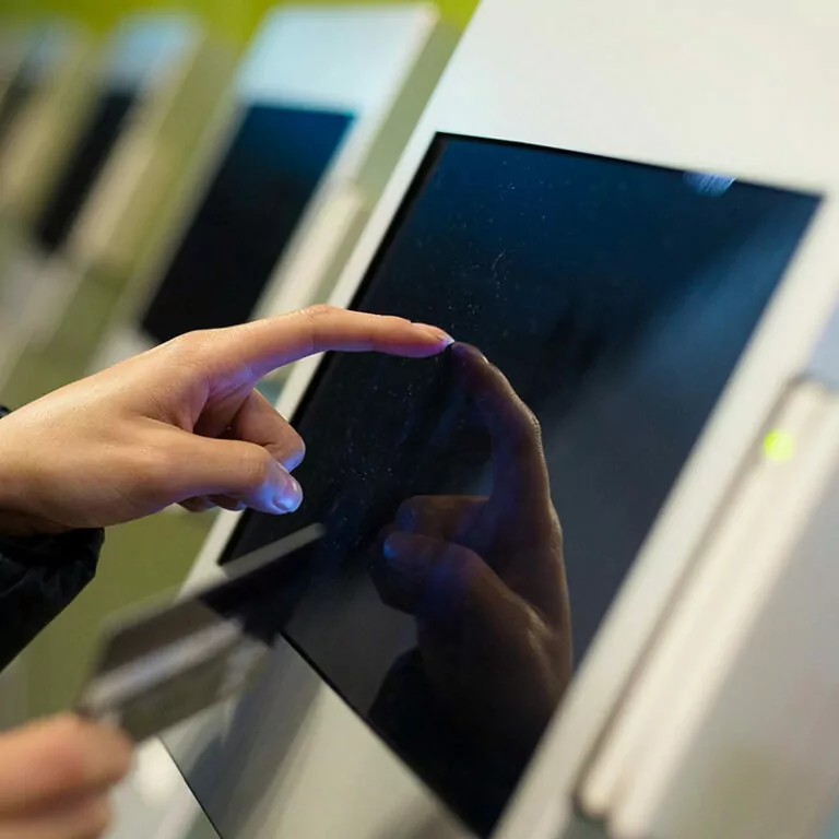
Withdrawing cash around the clock, putting together your own fast food menu or checking in for a flight: self-service terminals allow customers to carry out transactions independently on digital user interfaces.
These are interactive computer terminals, often in conjunction with a touchscreen in public spaces or semi-public locations such as customer foyers.
Digital touchpoint with its own rules
To ensure that self-service does not become a source of frustration and that your brand benefits from an optimal, efficient user experience, there are a few things to consider. Self-service terminals have their own rules that are very different from other digital touchpoints:
- Reduced attention and a lot of distraction during use (environmental events, exposure to environmental factors such as light, …)
- Unfamiliar interface that is only used sporadically
Little willingness to learn how to operate or adapt functions - No voice operation or audio output possible due to ambient noise
- Special discretionary requirements

Outstanding user experience turns self-service terminals into a brand experience
In addition to all the challenges, the self-service terminal has what it takes to become a touchpoint with a special brand experience. A stringently designed service experience on the self-service device rounds off the brand experience and can become a particularly lasting “moment of truth” in the customer’s relationship with your brand with a fast, efficient and pleasant user experience.
The dmcgroup’s strategies for designing successful self-service terminals:
- Focus on the essentials
Only what is really important at the moment is displayed. Step by step. - Clear user guidance
Simple language and clear call-to-actions support the quick understanding of the task. - Eliminate errors by design
Design processes in such a way that incorrect entries and “dead ends” are impossible. - Microinteractions for an enjoyable experience
Attention to detail makes the difference and the interaction memorable. - Automatic personalization
Wherever possible, relieve customers of work by intelligently linking data.
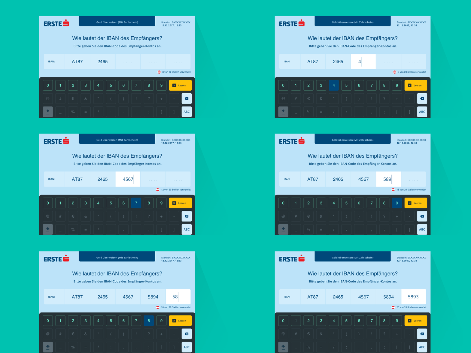
Case Study: Self-service UI for Erste Bank and Sparkassen
dmcgroup realized the new user interface for self-service terminals of Erste Bank and Sparkasse with a multidisciplinary product team in a 3-year collaboration. The banking group has around 4,000 self-service machines. In iterative implementation, accompanied by regular user tests, we were able to develop the new interface for self-service terminals in close cooperation with the bank.

We are happy to support you with our decades of expertise in the development of digital products and services to optimize your self-service terminals. An initial design workshop allows us to identify potential together and get projects on track – and is free of charge for you.
For more information on the subject of “Self-service terminal design”, please contact us at any time.
Stay
tuned
More articles
